T DE TI
Concept, Naming & Visual Identity
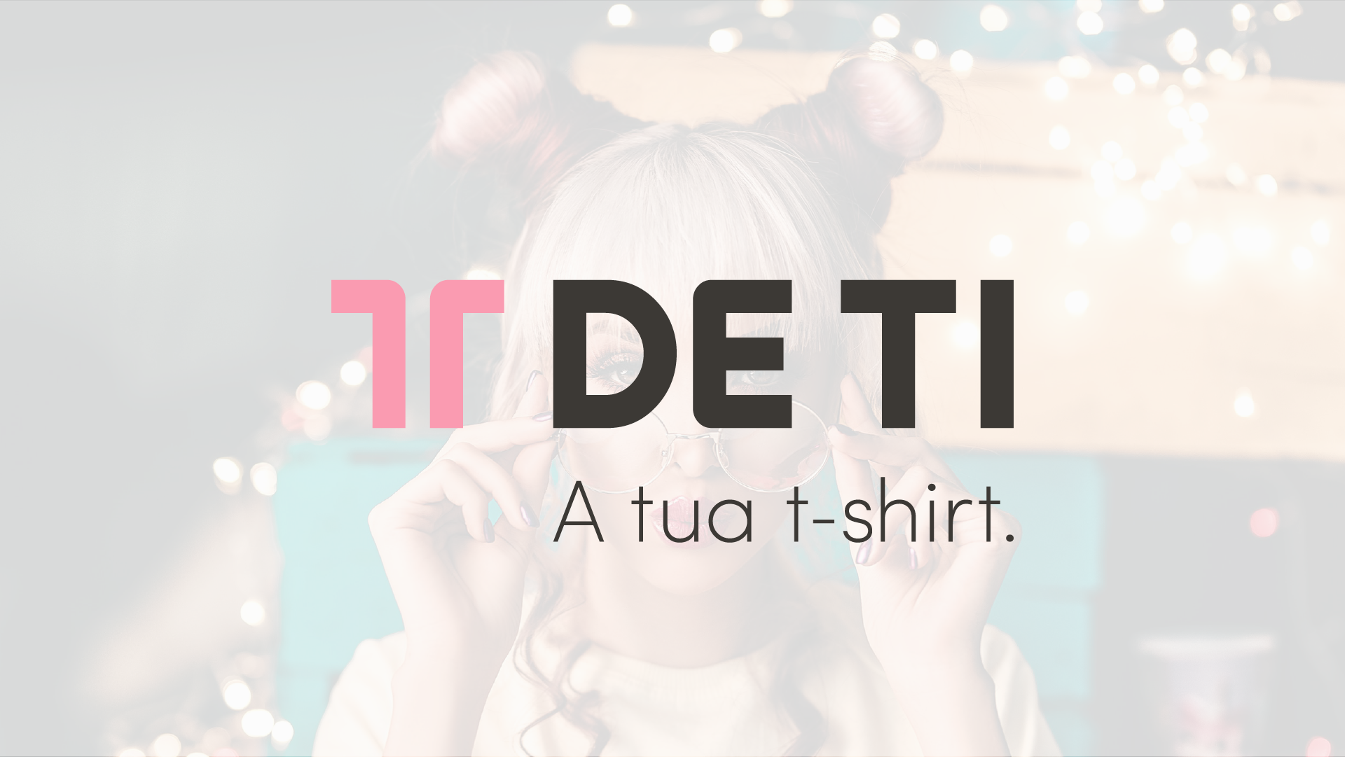
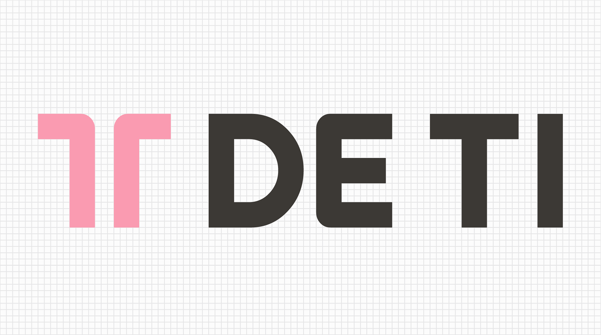
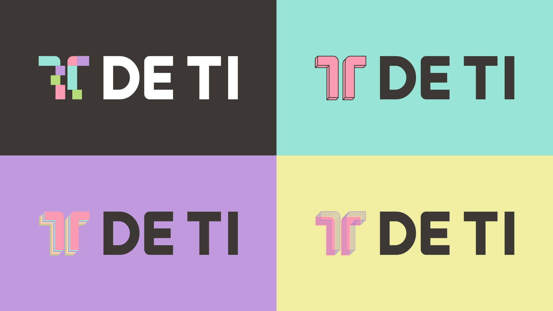
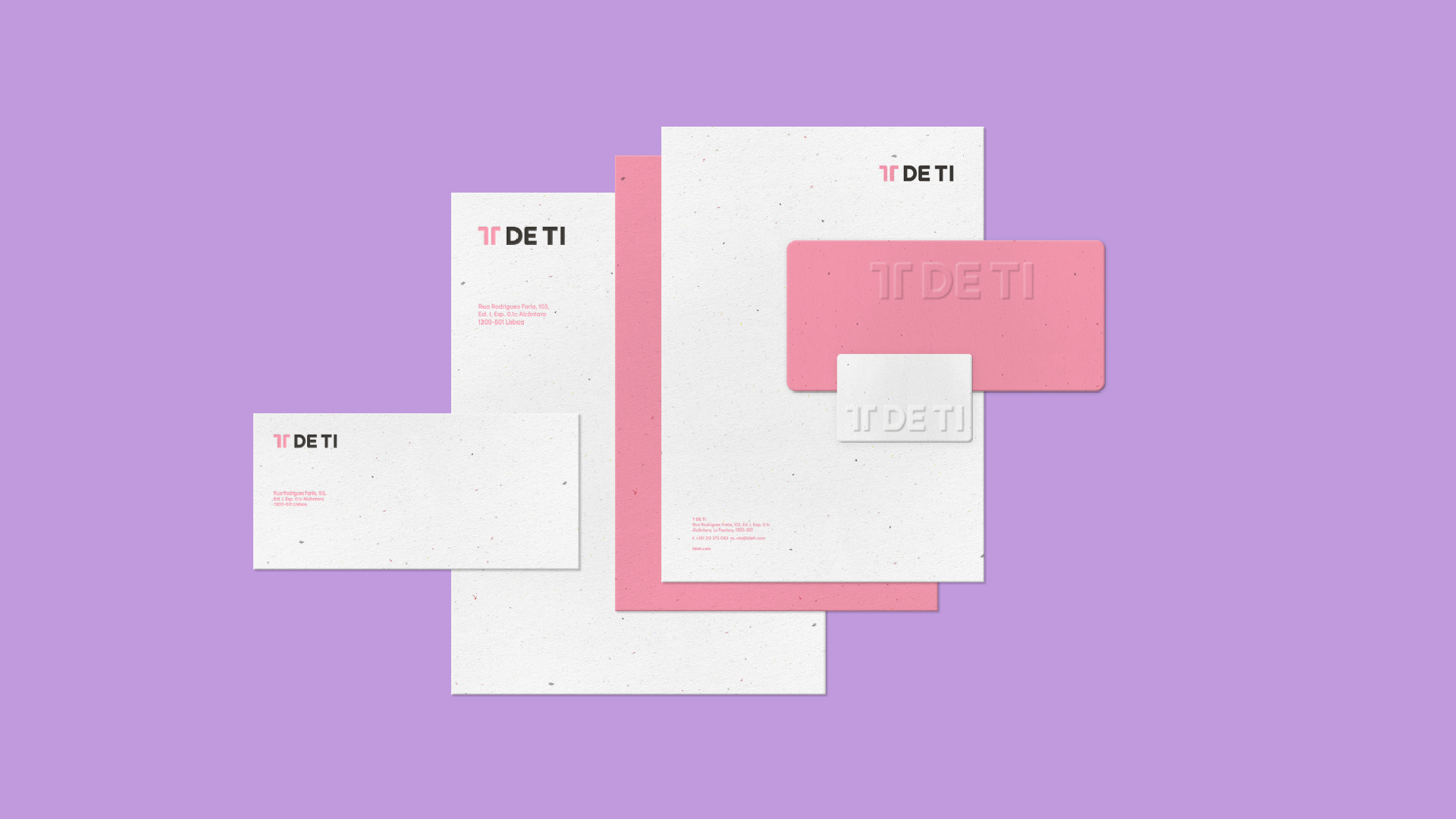
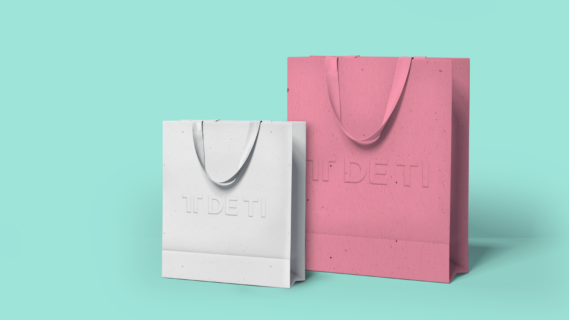
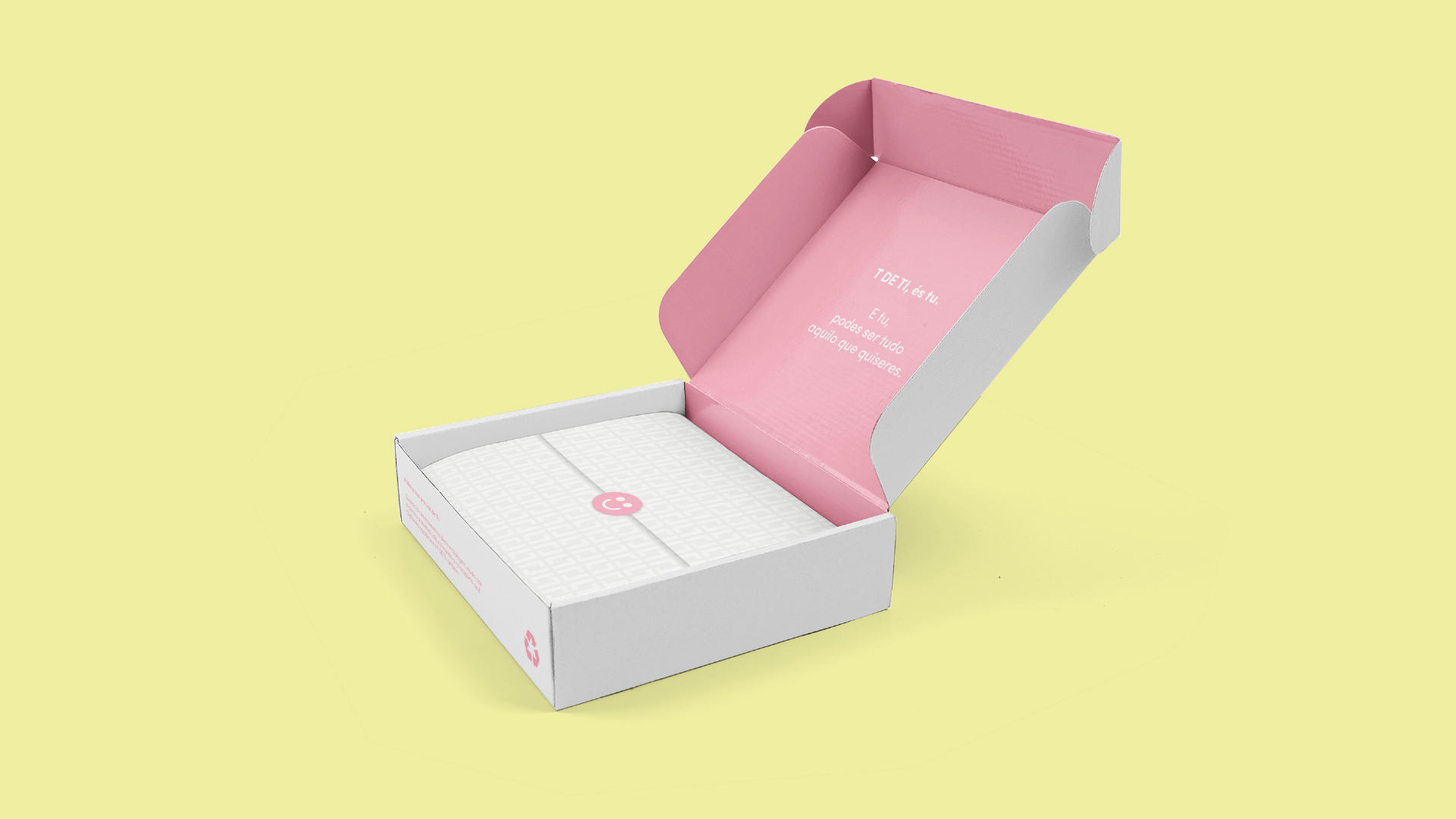
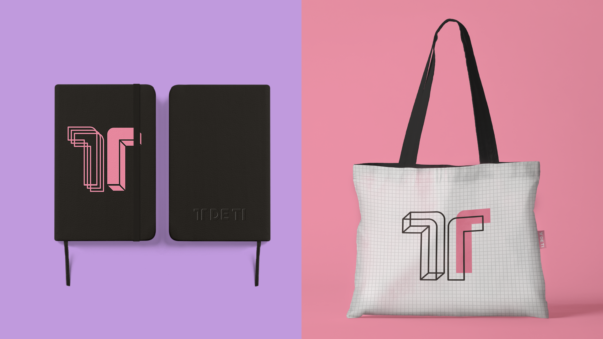
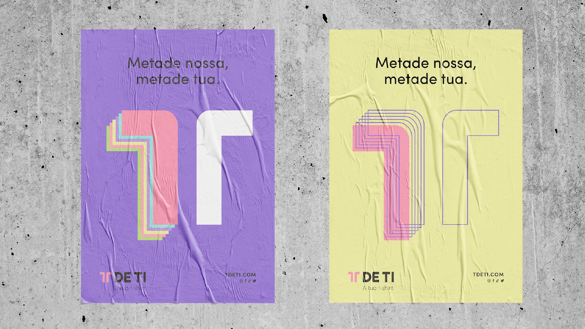
EN T DE TI stands out as a brand renowned for its signature t-shirts, where the customizable form and unique character are central to its distinctive appeal. The customer's influence is paramount in shaping the final design, a reflection evident not only in the brand's chosen name but also in its overall identity. The "T," cleverly alluding to the garment's shape, symbolizes both "t(i)-shirt" and "ti," creating a subtle connection with the customer as "ti" means "you" in portuguese. Just like the versatile t-shirts, the logo exhibits dynamism, allowing for changes to align with different collections, days, or occasions, ensuring a fluid and adaptable brand presence.
PT T DE TI é uma marca cuja peça de assinatura são as t-shirts. A sua forma e carácter personalizável são o veículo de distinção principal. O papel da cliente é fulcral na obtenção do design da peça final e isso teria de estar espelhado tanto no naming pensado para a marca, como na própria identidade. O “T”, aludindo à forma da peça, é de “t(i)-shirt” e de “ti”, referindo-se à cliente. Assim como as T-shirts, também o logo é dinâmico e pode mudar consoante as colecções, dias e/ou ocasiões nas quais essa transformação se justifique.


Concept, Design & Art Direction Claudia Domingues
Course Fashion Marketing
School Lisbon School of Design