Solar
Visual Identity
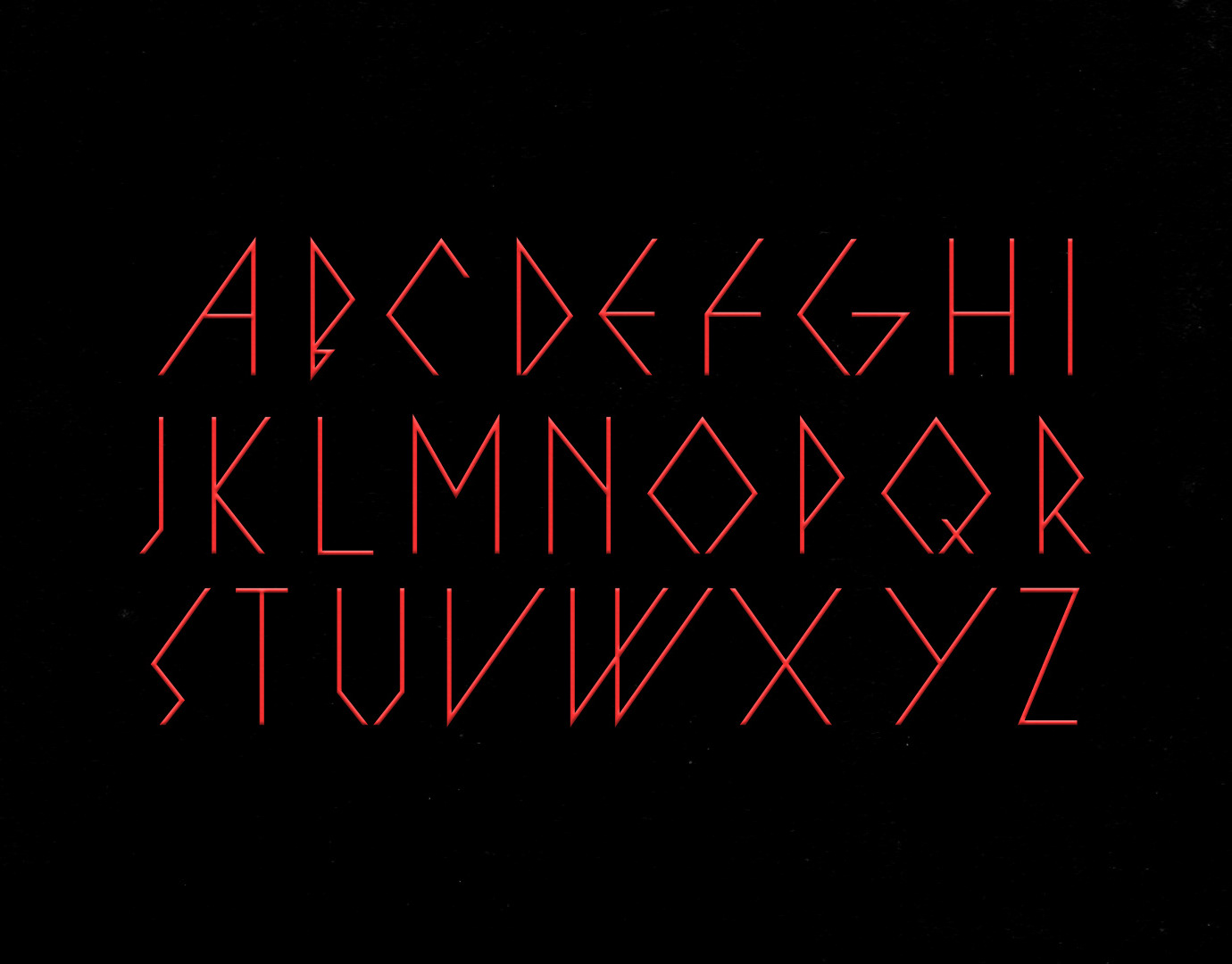
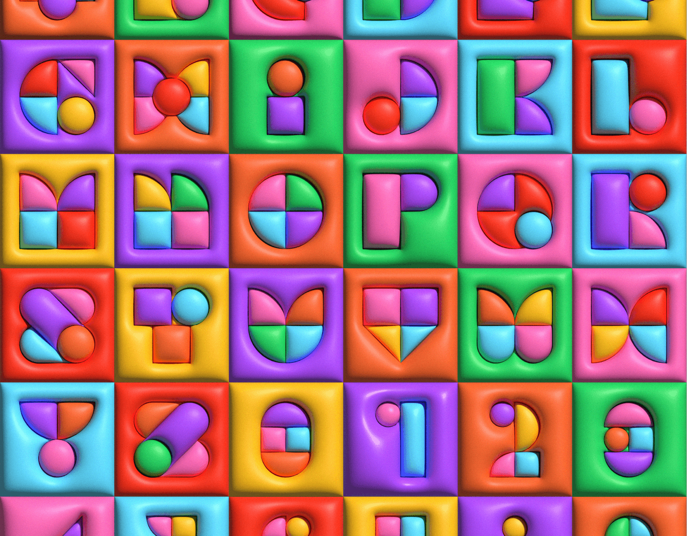
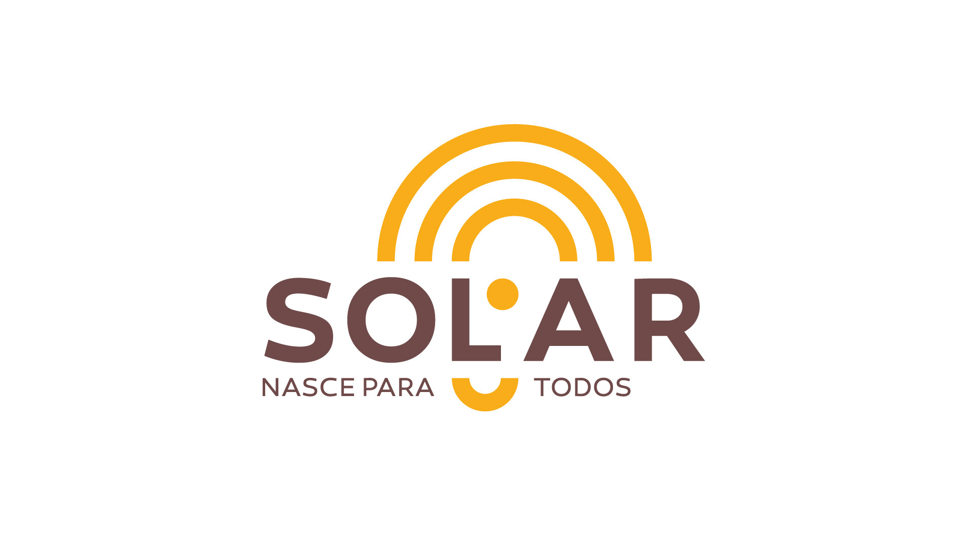
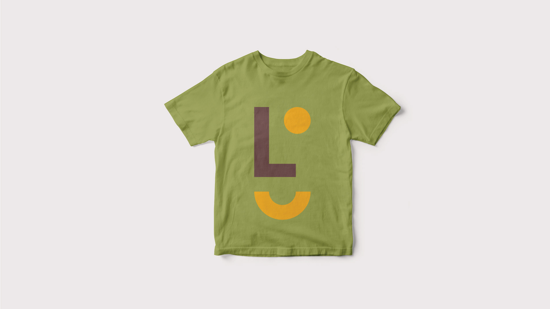
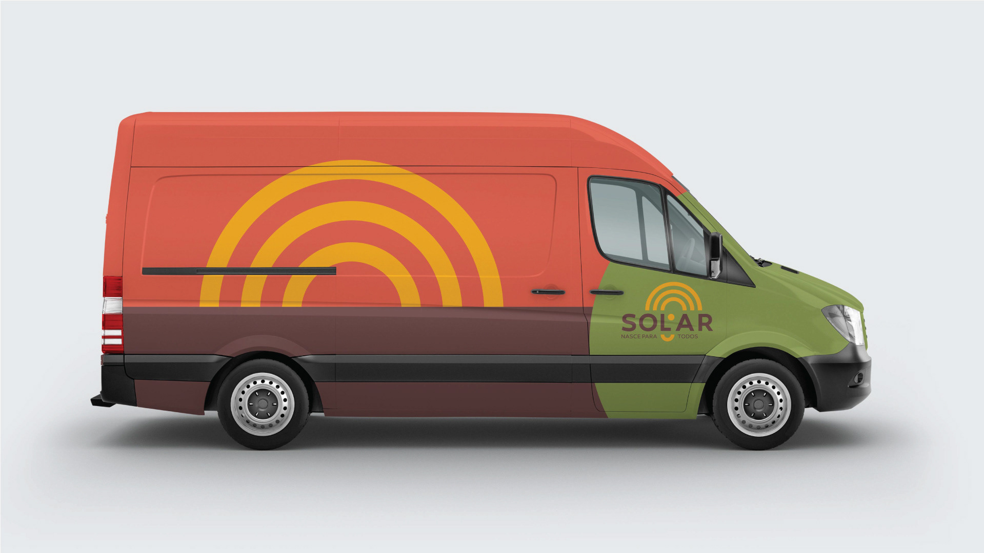
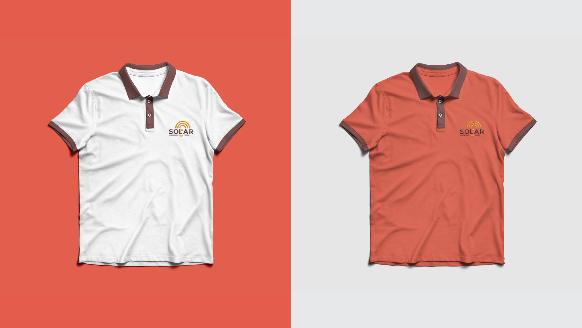
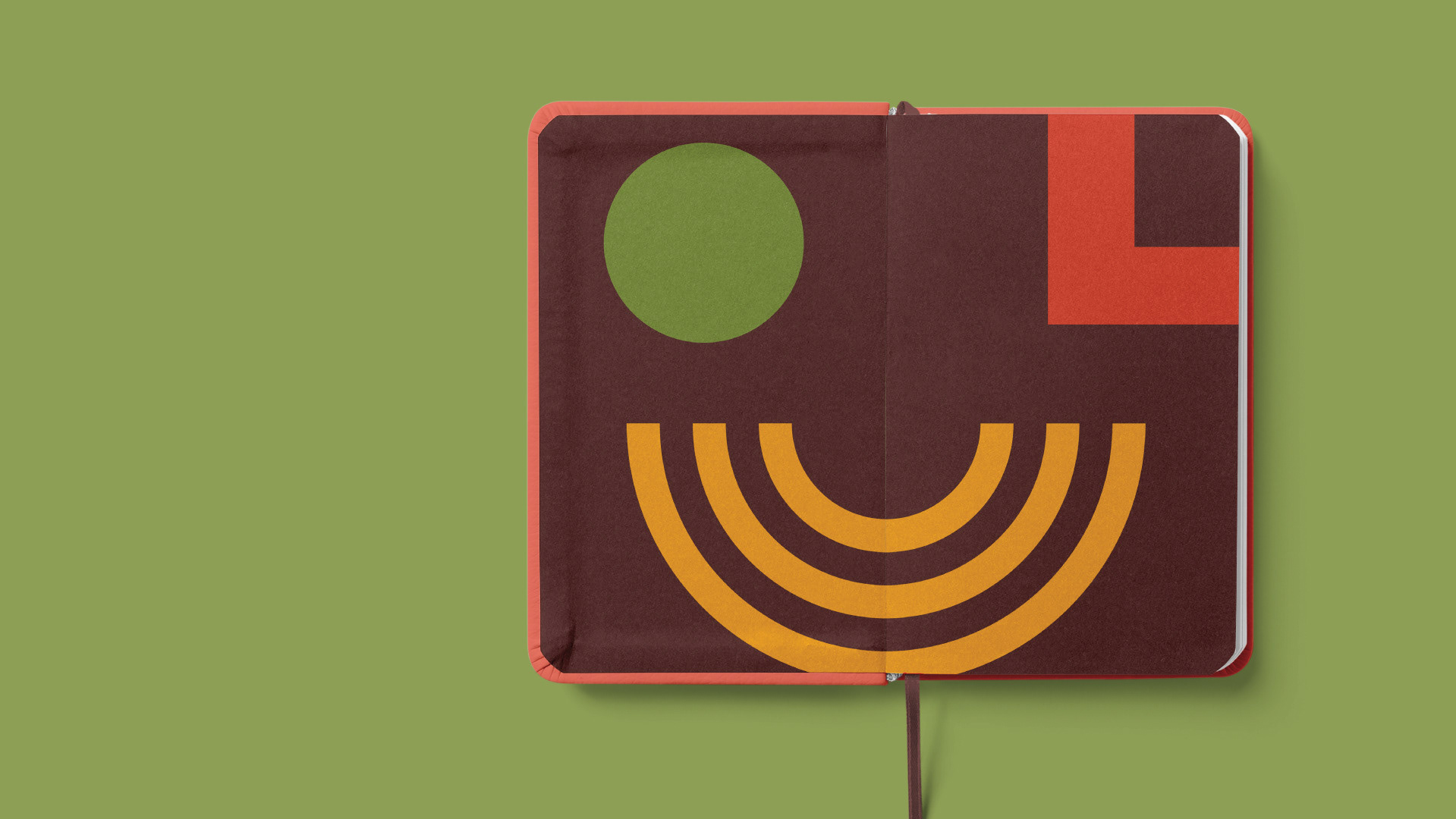
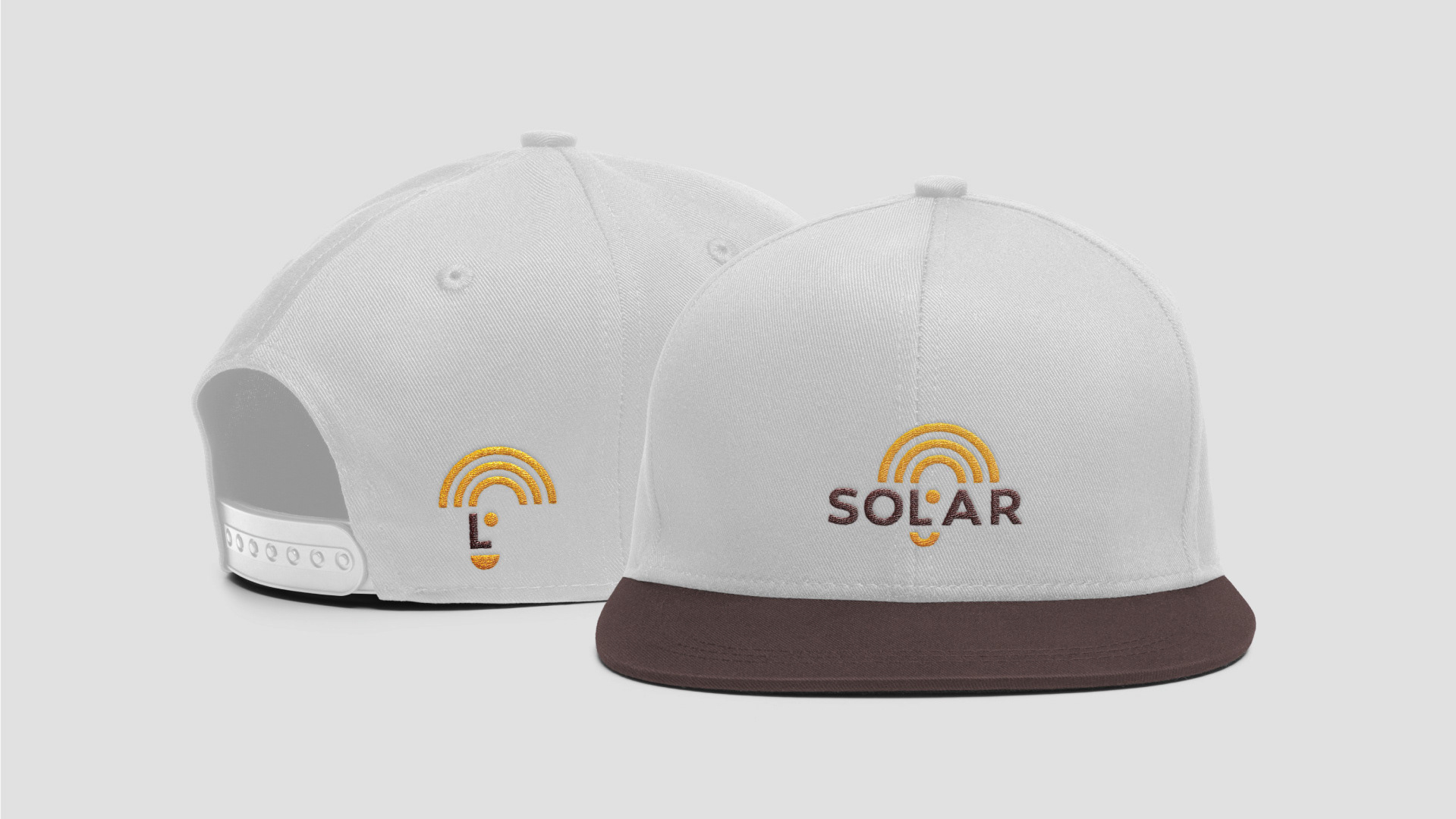
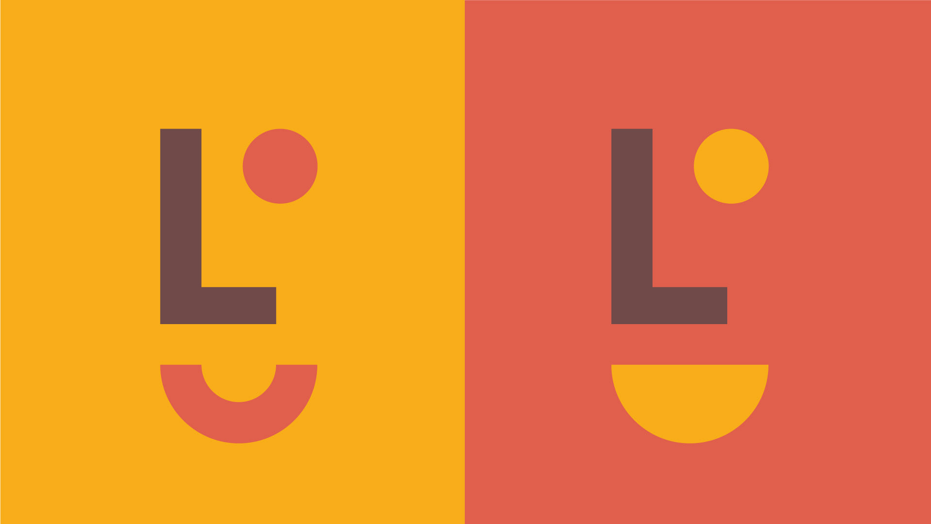
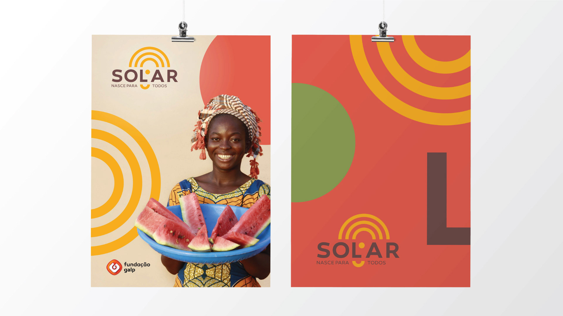
EN Galp is reformulating its social responsibility strategy. The first step is to create the brand for a project that takes energy to rural communities in Mozambique. The project is based on the application of solar panels in rural villages. A clear way to take advantage of local energy in favor of communities, making their lives increasingly sustainable. And for that to happen, solar energy is essential for the development of the project. And it will also be the inspiration for its identity. In Mozambique, there is a popular expression for a sunny day: solar (ex: today it is solar.) And in this project, sunny days make the difference, because when it rises, it means energy for everyone. Graphically, this identity shows the human side of the project, embodied in a stylized face based on the letter L, with reference to the tribal masks of regional culture. The face also shows us the real consequence of the project, creating structures for a happier life. By deconstructing this element outside the logo, we also achieve a visual universe rich in illustrations that can feed the various moments of communication. With this union of cultural references, we managed to find a genuine brand, based on the truth of the project , in line with a modern and appealing look.
PT A Galp está a reformular a sua estratégia de responsabilidade social. O primeiro passo é a criação da marca de um projeto que leva energia a comunidades rurais, em Moçambique. O projeto tem como base a aplicação de painéis solares em vilas rurais. Uma forma clara de aproveitar a energia do local a favor das comunidades, tornando a sua vida cada vez mais sustentável. E para que isso aconteça, a energia solar é essencial para o desenvolvimento do projeto. E será ela também a inspiração para a sua identidade. Em Moçambique, existe uma expressão popular para um dia de sol: solar (ex: hoje está a solar.) E neste projeto os dias de sol fazem a diferença, porque quando ele nasce é significado de energia para todos. Graficamente esta identidade mostra o lado humano do projeto, concretizado numa cara estilizada a partir da letra L, com referência nas máscaras tribais da cultura regional. A cara mostra-nos também a consequência real do projeto, criando estruturas para uma vida mais feliz. Ao desconstruir este elemento fora do logótipo, conseguimos também um universo visual rico em ilustrações que podem alimentar os vários momentos de comunicação. Com esta união de referências culturais, conseguimos encontrar uma marca genuína, assente na verdade do projeto, alinhada a um visual moderno e apelativo.


Credits Design & Art Direction Claudia Domingues
Copywriter Claudio Soares
Creative Direction Daniel Palma
Agency Wunderman Thompson
Client Galp