Aptoide AppStore
Visual Style Guide & Global Communication
EN A comprehensive Visual Style Guide was designed to reinforce the brand's coherence in both external and internal communications. This involved defining a harmonious chromatic palette, selecting typography that aligns with the brand ethos, and specifying the type of illustrations that encapsulate its identity.
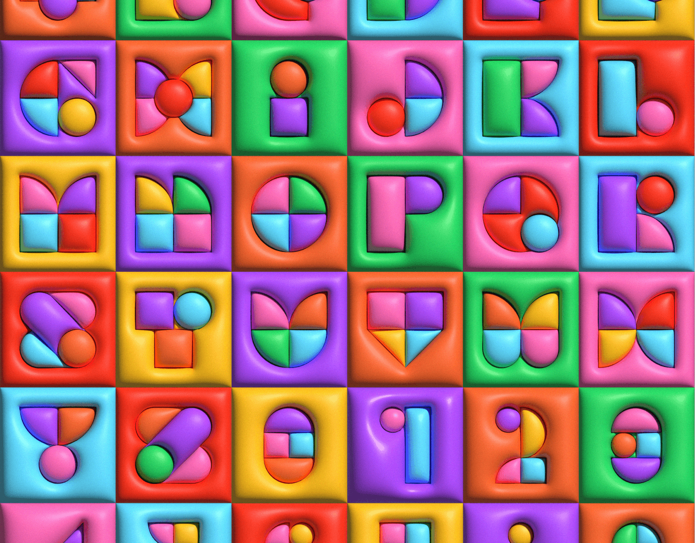
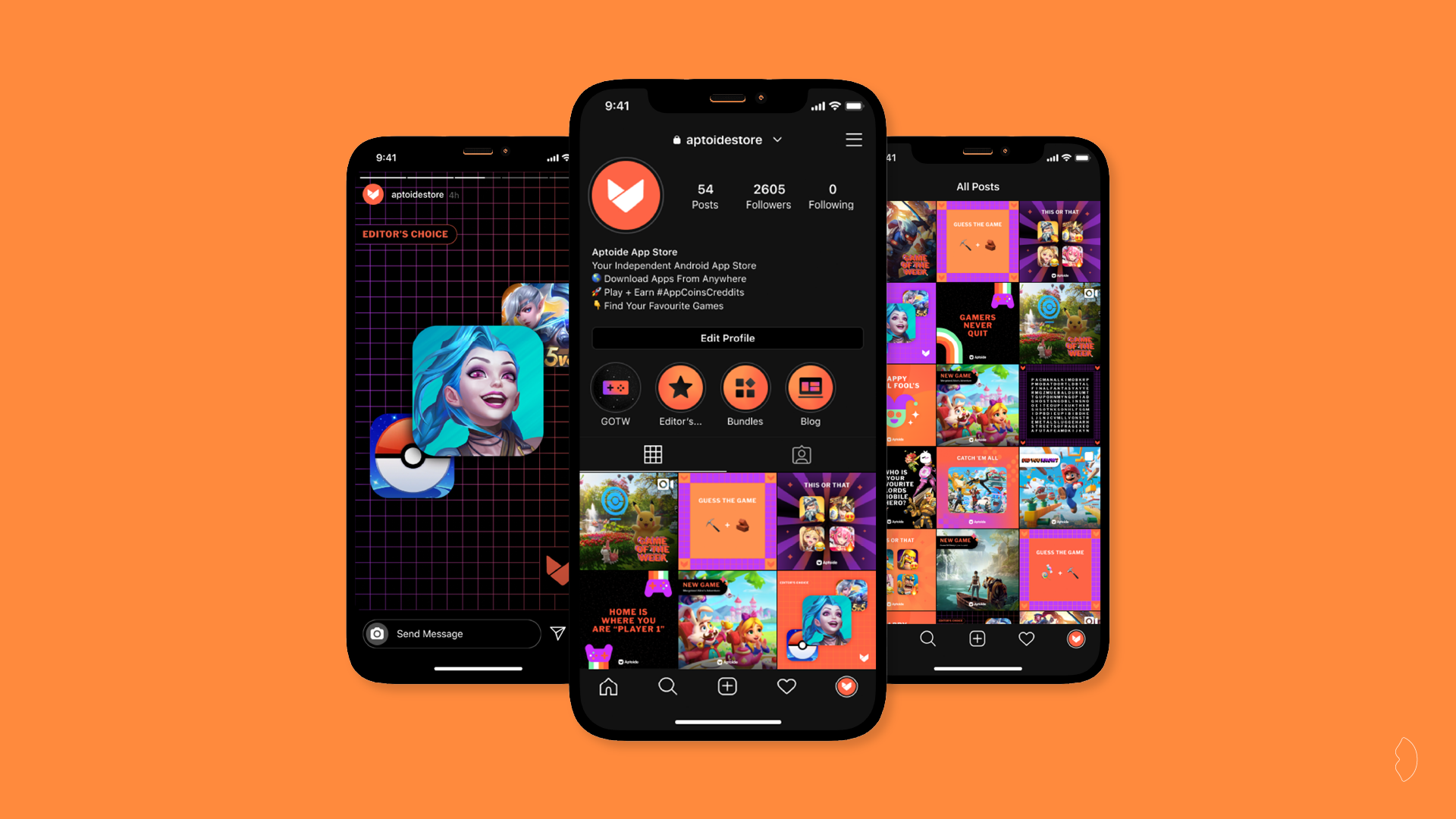
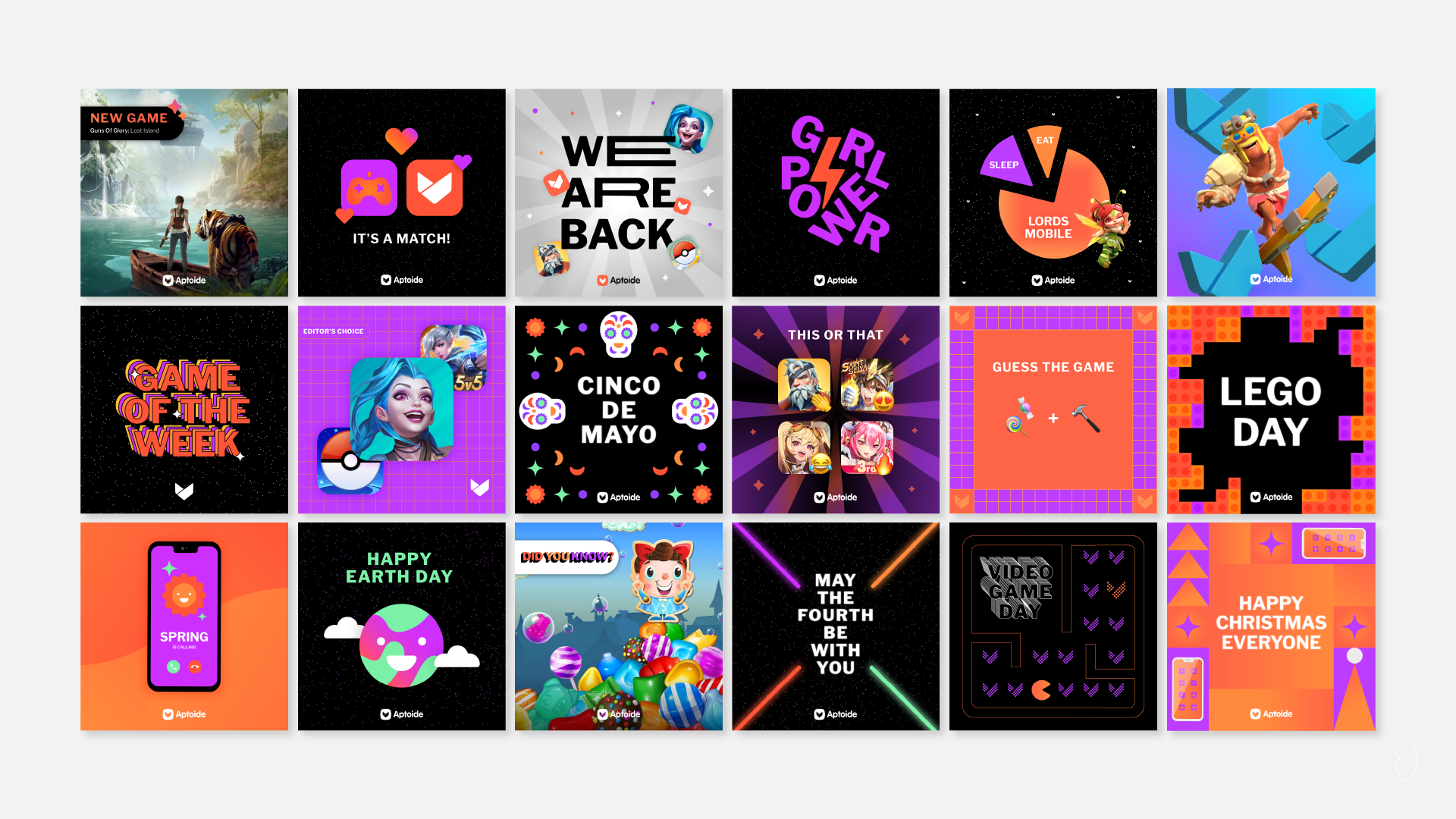
In addition, a diverse range of illustrations was meticulously designed to infuse dynamism into the brand's communication across various social networks. These efforts not only enhance the brand's visual appeal but also ensure a consistent and compelling presence in the ever-evolving landscape of digital communication.
PT Foi criado um Guia de Estilo Visual completo para reforçar a coerência da marca na comunicação interna e externa. Definiu-se uma paleta cromática harmoniosa, tipografia alinhada com a identidade da marca e o tipo de ilustrações que melhor a representam.
Além disso, foi desenvolvida uma variedade de ilustrações para dar dinamismo à comunicação da marca nas redes sociais. Estas medidas não só reforçam o seu impacto visual, como garantem uma presença consistente e envolvente no universo digital em constante evolução.

Brand Illustrations: Summer Internships

Brand Illustrations: Douro Retreat

Brand Illustrations: Wallpaper

Brand Illustrations: General

Internal Communication: Feedback Sessions

Internal Communication: OKR Sessions

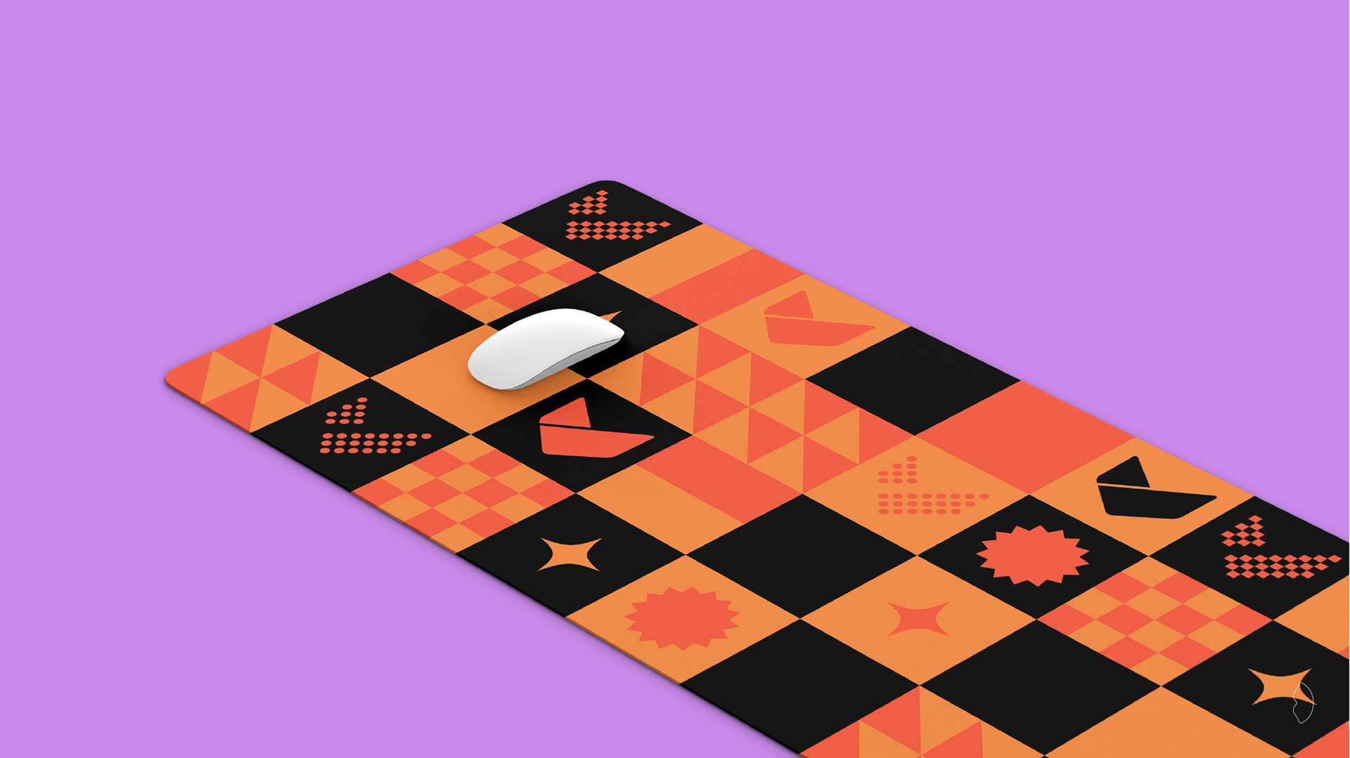
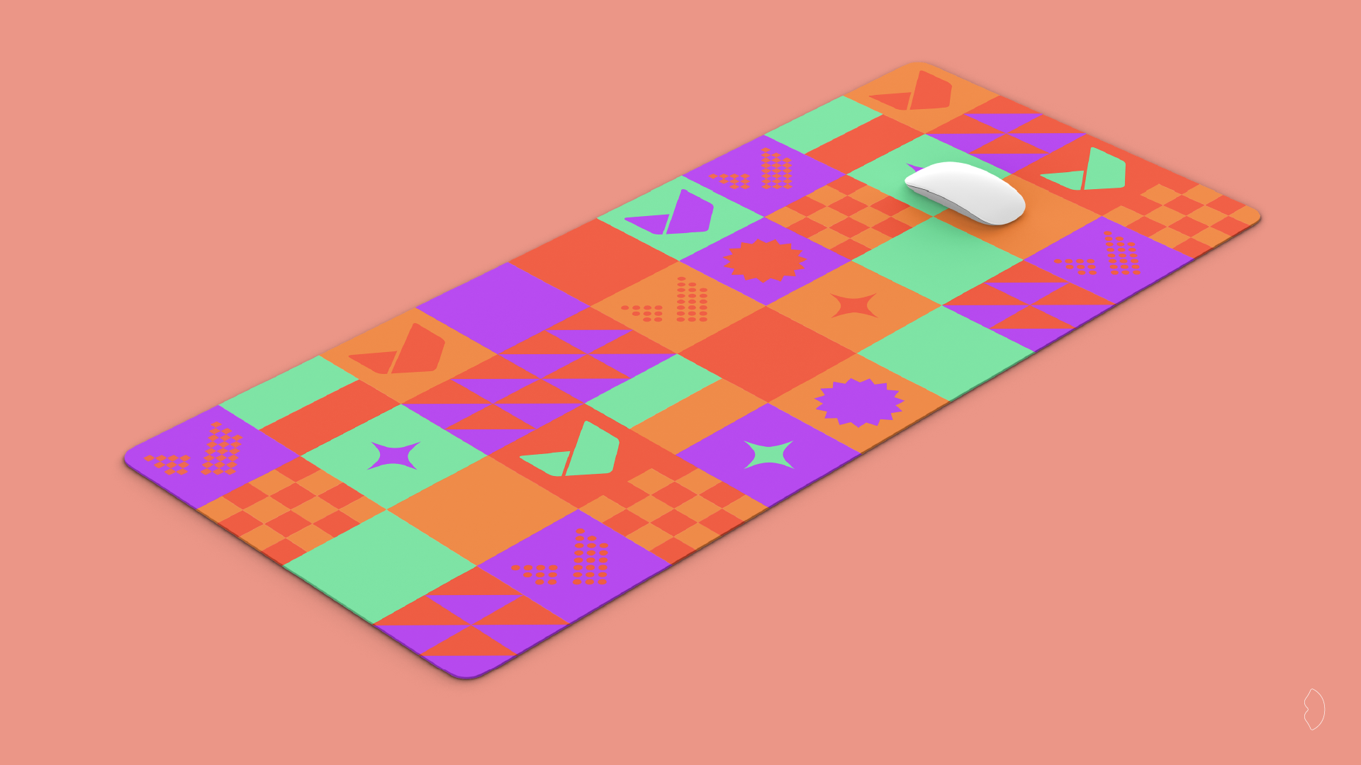
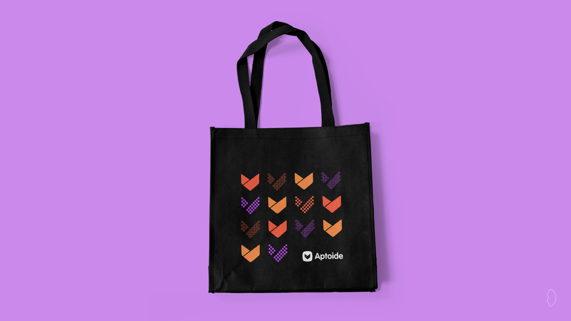
Aptoider Kit
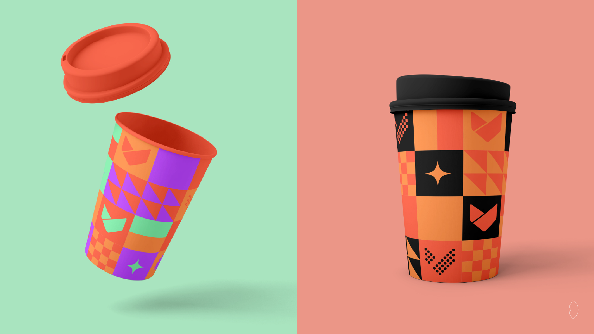
Creative development of a merchandising line for the Aptoide App Store. The visual concept involved creating a fun illustration using the brand's cores and graphic elements so that all employees, even working remotely, have Aptoide present in their home office.
Desenvolvimento criativo de linha de merchandising para a Aptoide App Store. O conceito visual passou por criar uma ilustração divertida utilizando as cores e os elementos gráficos da marca de forma a que todos os colaboradores, mesmo trabalhando remotamente, tenham a Aptoide presente no seu home office.
Design & Art Direction Claudia Domingues
Client Aptoide