Manifesto
Visual Identity
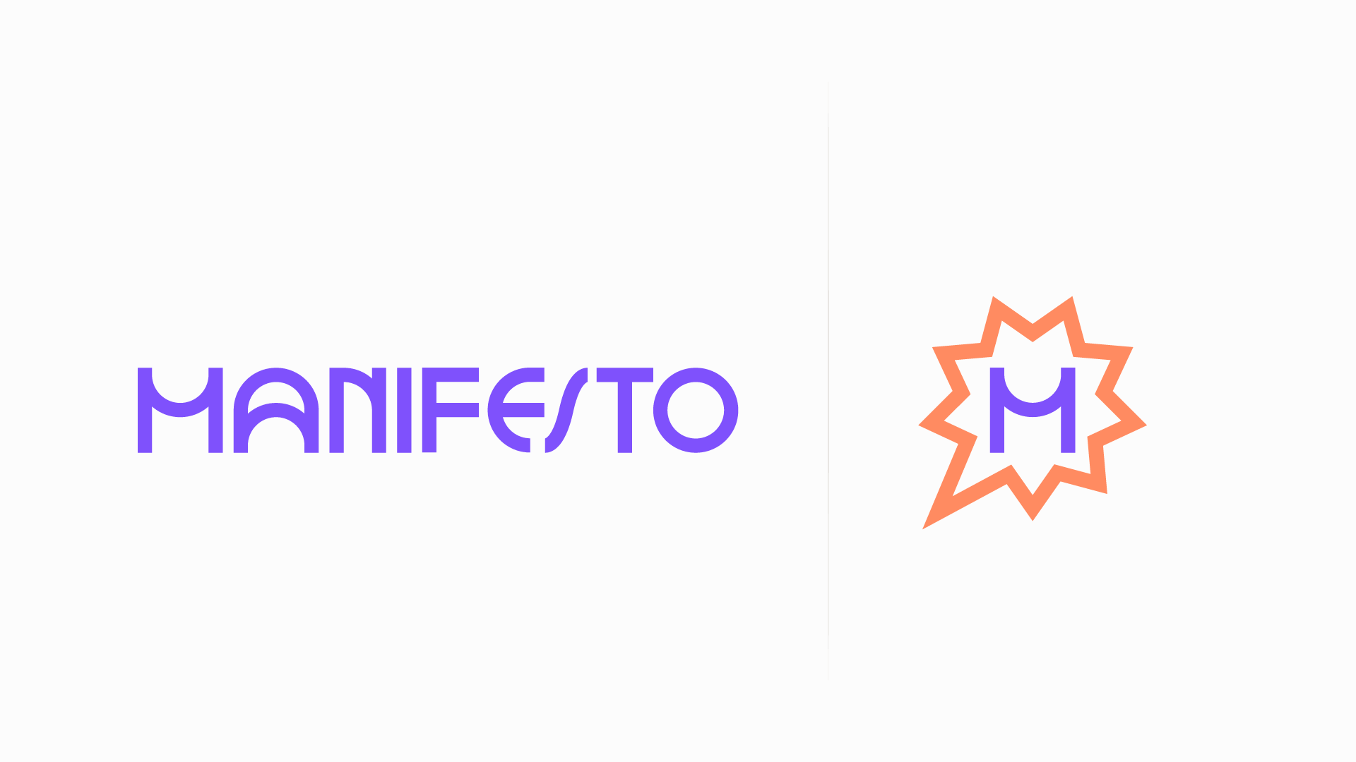
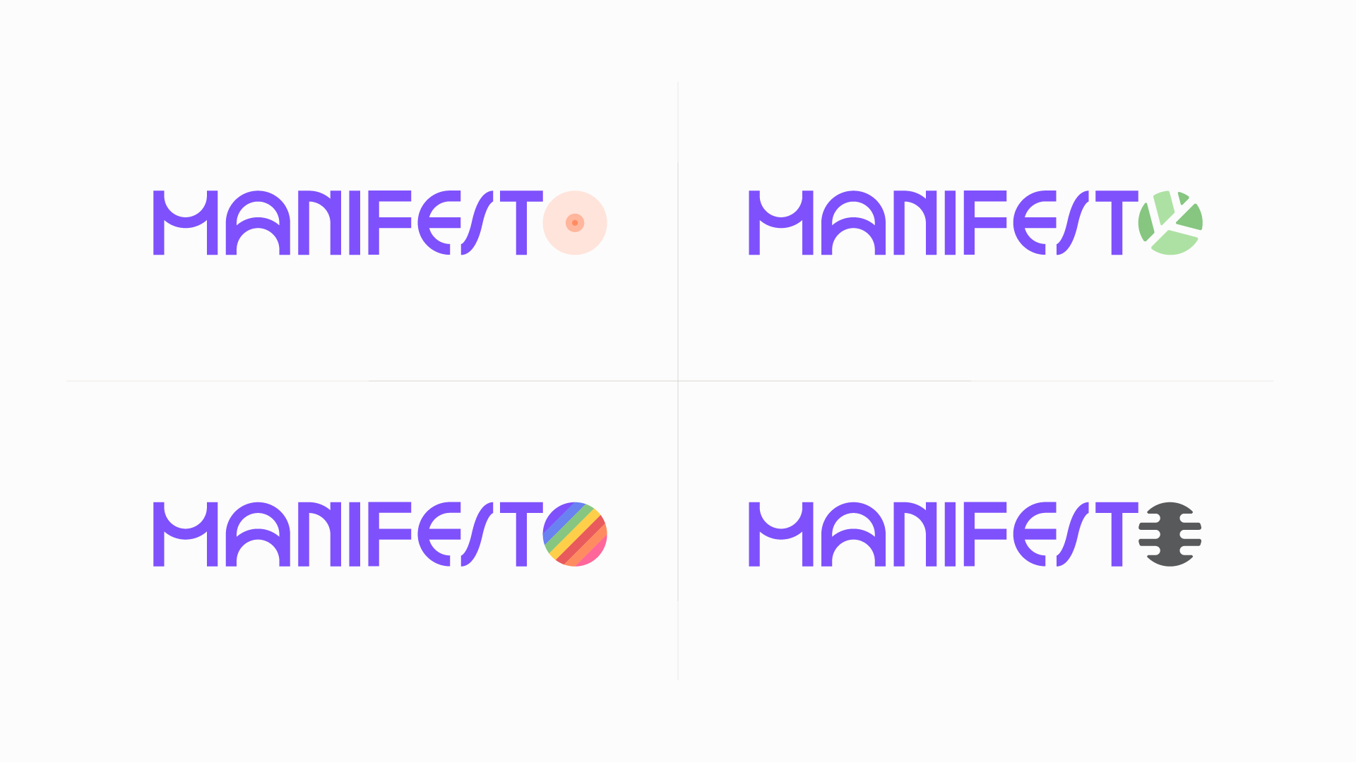
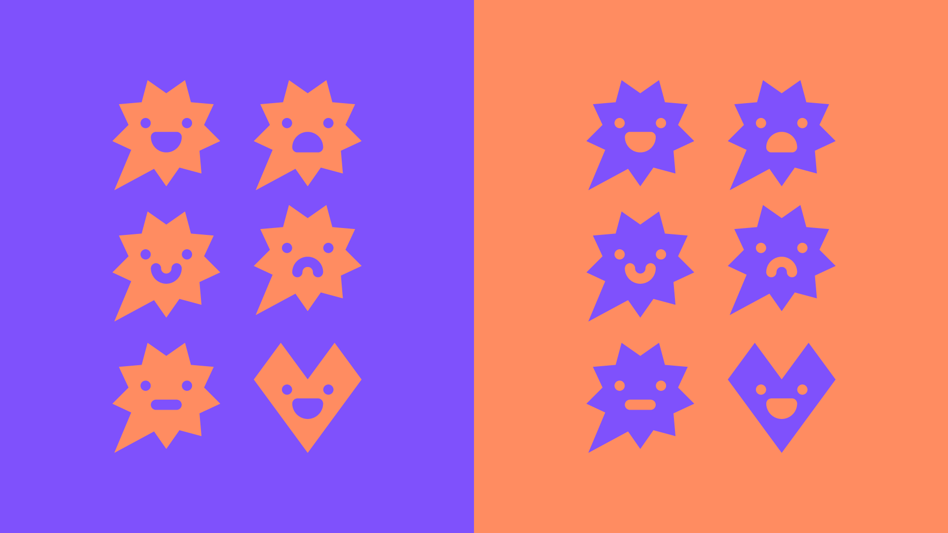
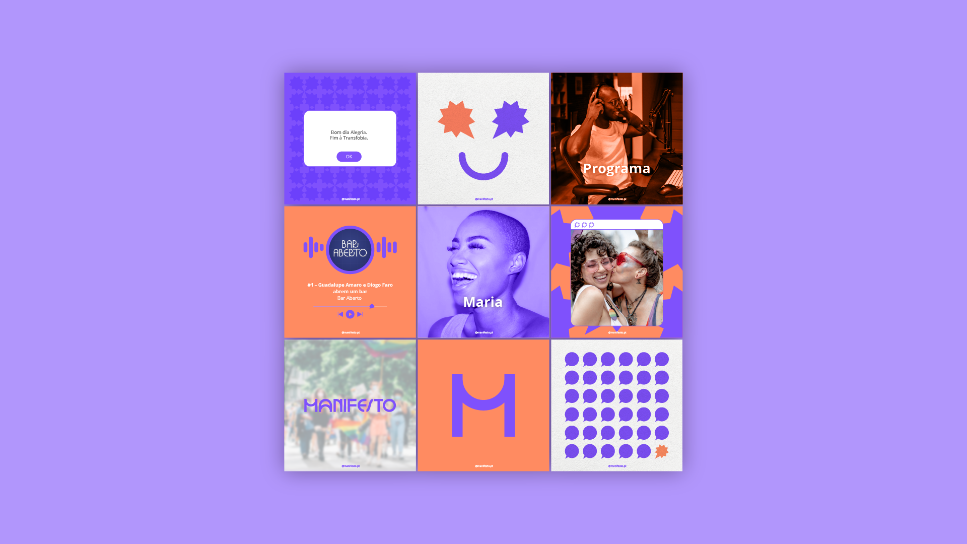
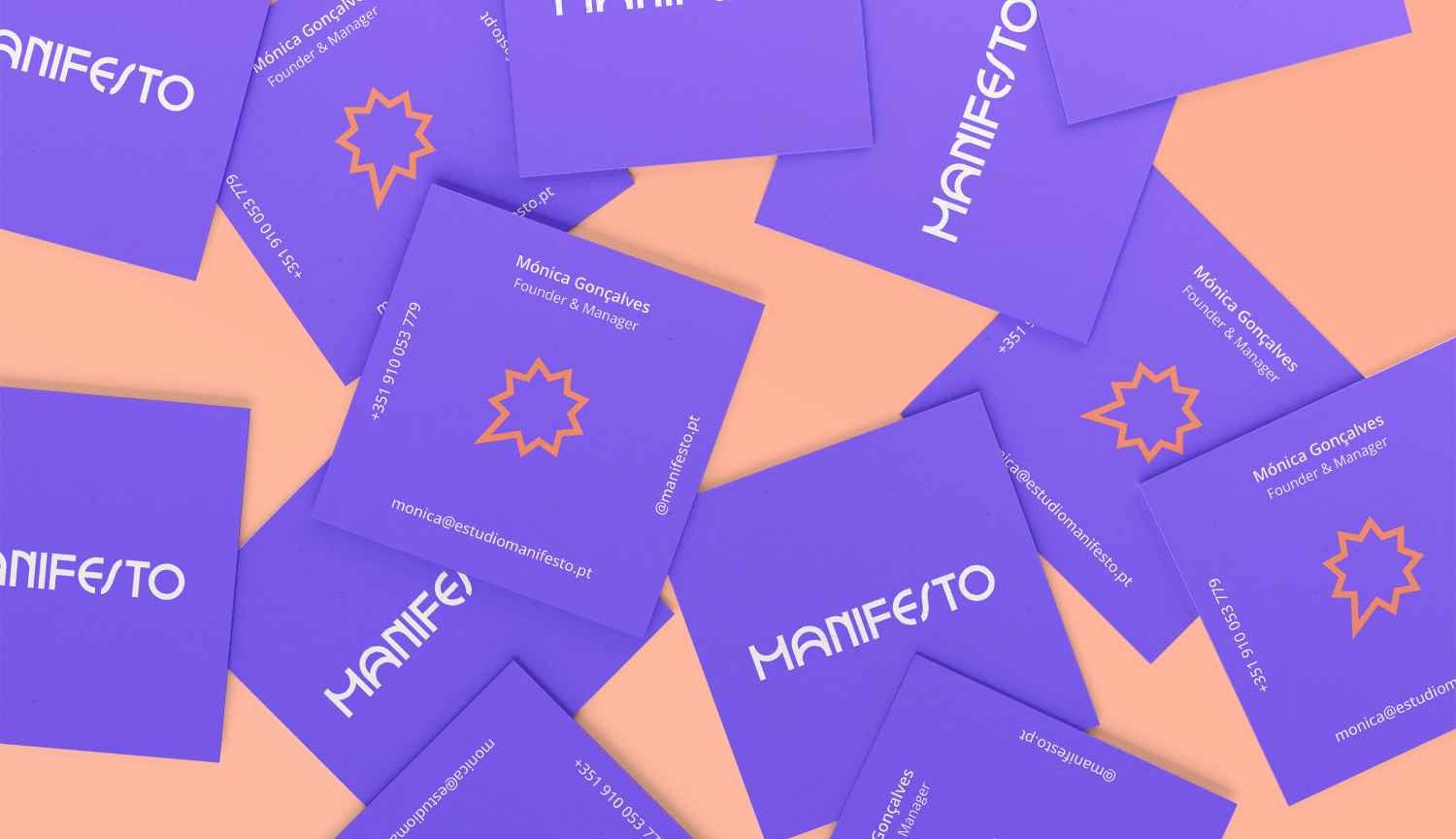
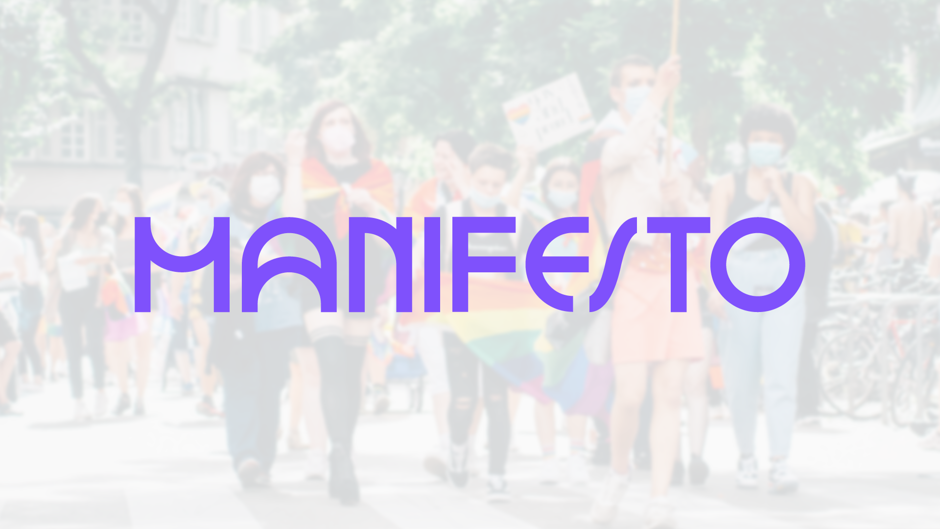
EN Manifesto is more than a communication studio—it’s a collective of active voices shaping society. It represents impactful individuals with meaningful messages, standing out through action and influence. The new visual identity embodies this purpose, built around six key concepts: activism, impact, voice, representativeness, inclusiveness, and dynamism. A custom typography reinforces uniqueness—each letter in “Manifesto” varies in width and shape, symbolizing diversity. The “O” is the core symbol, representing both a speech bubble and a bold statement—an active scream, shaped as a nine-pointed star with one point extended to signify voice. This identity is fluid, adapting in colors and forms, just like the personalities it represents. The color palette carries meaning: purple, a nod to the suffragist movement and the studio’s roots, and orange, symbolizing security and alertness—both central to Manifesto’s mission. In essence, Manifesto’s identity mirrors its essence: difference, impact, and the power of representation and activism.
A paleta de cores tem um significado: o roxo, uma homenagem ao movimento sufragista e às origens do estúdio, e o laranja, que simboliza segurança e alerta—valores essenciais à missão do Manifesto.
Em suma, a identidade do Manifesto reflete a sua essência: diferença, impacto e o poder da representatividade e do ativismo.